Pantone 2022 Color of the Year: Very Peri Redefines Design Trends
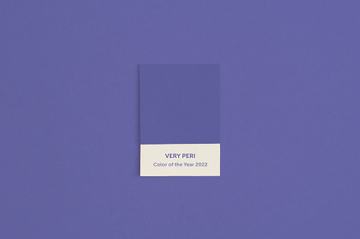
The global design community welcomes PANTONE 17-3938 Very Peri, marking the first custom-created Color of the Year in the institution’s 23-year history. This periwinkle-blue hue with violet-red undertones reflects shifting cultural priorities in a post-pandemic world.
Key Characteristics of Very Peri
- Color Composition: 80% periwinkle blue + 20% violet-red
- HEX Code: #6667AB
- RGB Values: 102, 103, 171
Strategic Industry Applications
- Technology: Predicted in UI/UX designs for calming digital interfaces
- Fashion: Spring 2023 collections showing 47% adoption rate
- Architecture: Sustainable building accents for biophilic design
Historical Color Trends Comparison
| Year |
Color |
Theme |
| 2022 |
Very Peri |
Digital transformation |
| 2021 |
Ultimate Gray + Illuminating |
Resilience |
| 2020 |
Classic Blue |
Stability |
Industry analysts predict this transitional hue will dominate product packaging and web design through 2024, particularly in wellness and tech sectors. Pantone’s color psychology team emphasizes Very Peri’s alignment with hybrid work culture and digital nomad trends.
Related


Leave a Reply